SACS Pro, CMS
Designing a scalable CMS experience for faster editorial publishing workflows.
Focus: CMS / Editorial Platform / UX Strategy
Role: UX/UI Designer
Platform: Responsive Web Platform / Simplified Mobile Experience
Audience: Journalists, Editors, and Editorial Teams
Year: 2025
Team: Product Owner, Developers, Sole Designer
Design System: Adapted from Admin UI Color library
Primary Modules: Article Form, Content Editor, Image Gallery, Content Prioritization, AI Assistant, UX Writing, Dashboard, Data Insights
Research: I interviewed 5 editors to understand their pain points.
Testing: I ran moderated usability tests with 3 specific tasks.
Key finding: Publishing required 4 clicks — too slow for breaking news.Decision: Simplified to 2 clicks based on test results.
Context
SACS is a modular CMS platform designed for editorial teams managing high-volume digital content. Used by media outlets and publishers across LATAM, the platform serves approximately 468 active users. As the sole designer on the project, I led the redesign of 8 core modules working within the Color Admin UI framework — adapting and extending the existing component library to meet editorial-specific needs without rebuilding the system from scratch. This constraint shaped every decision: the goal wasn't a blank-canvas redesign, but a smarter use of what already existed.
Problem
- No clear information hierarchy in editorial workflows.
- Many users relied on repetitive actions and inefficient navigation.
- The experience depended too heavily on outdated interaction patterns.
Constraints
- Editorial teams with varying technical experience.
- The platform was also highly customizable for different media clients, requiring flexible interface solutions.
- Legacy components and backend limitations.
Goals
- Create a more intuitive editorial workflow.
- Reduce cognitive overload and interface clutter.
- Improve content discoverability and task efficiency.
- Streamline publishing actions across modules.
- Establish scalable UI patterns for future growth.
- Improve usability across editorial roles.
Process
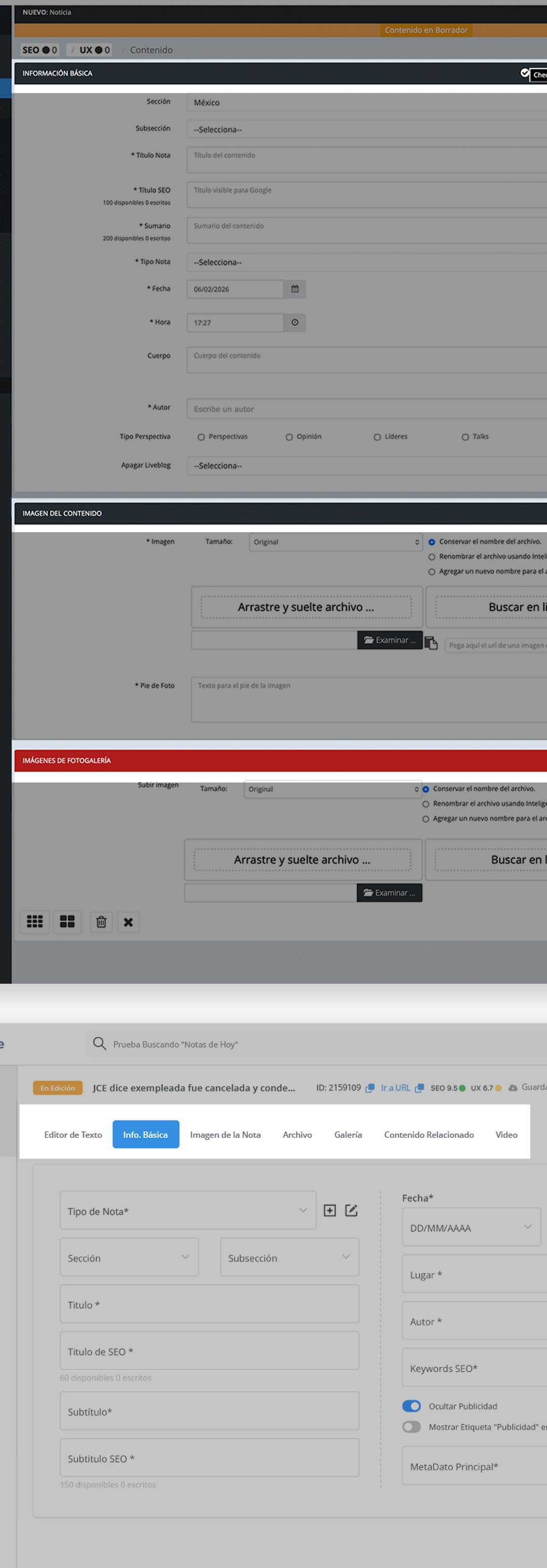
The redesign started from a core usability problem in the Article Form — the most-used module in the platform. Editors were working with a single, continuous scroll that mixed basic metadata, image upload, gallery management, and video in one unstructured page. Everything was visible at once, which meant nothing felt prioritized.
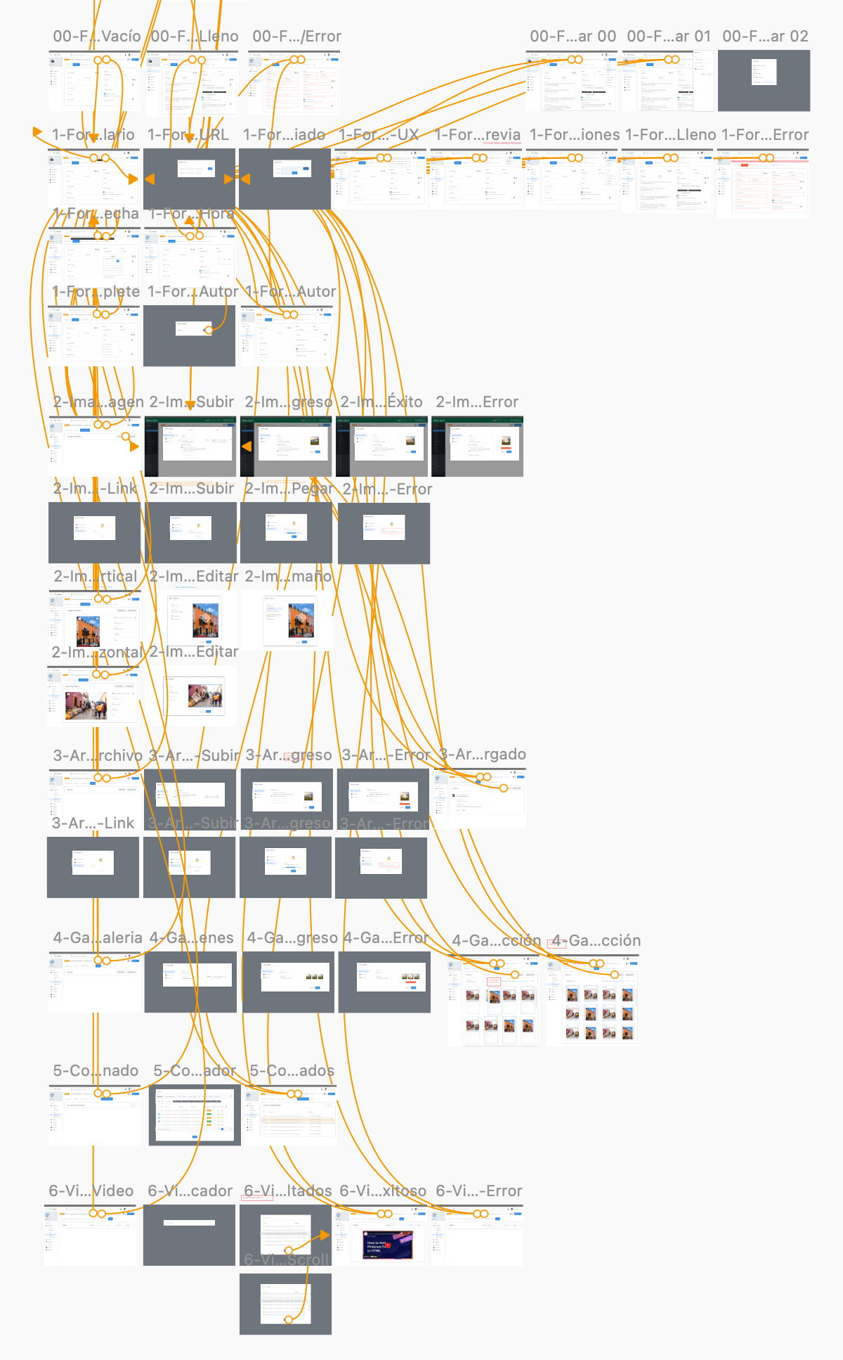
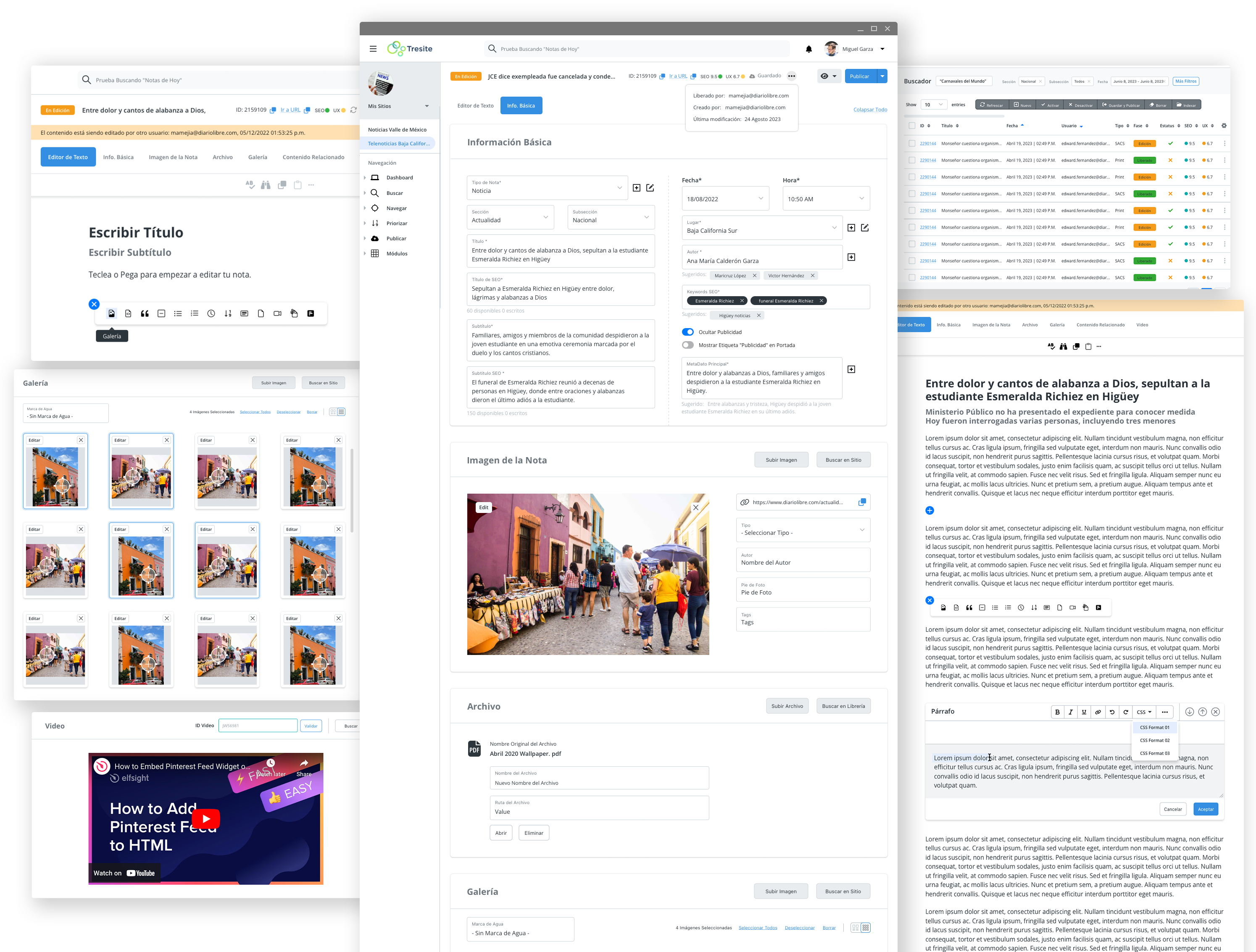
The solution was a tab-based architecture that restructured the workflow from one long sequential form into a focused, task-based system: Editor de Texto, Info. Básica, Imagen de la Nota, Archivo, Galería, Contenido Relacionado, and Video. Each tab shows only what's needed for that specific step — turning a 4-stage sequential process into 2 primary decision points per session, reducing cognitive load and making it harder to miss required fields.
This same logic — show only what's needed, when it's needed — became the design principle applied across all 8 modules. Every redesign decision traced back to the same question: what does this editor actually need to do right now, and what's getting in the way?
All modules were redesigned within the Color Admin UI framework, extending and adapting existing components rather than rebuilding from scratch — a constraint that required as much editorial judgment as visual design.t
Article Form: from a single scroll to a task-based tab architecture
Strategy
- Reorganized navigation around editorial priorities.
- Simplified publishing workflows across the project input form, content editor, and search experience.
- Introduced reusable interface patterns for consistency.
- Improved visual hierarchy using spacing, typography, and layout.
- Optimized content organization for faster scanning and task completion.
- Built scalable UI foundations using the Color Admin framework as a base system for consistency and faster implementation.
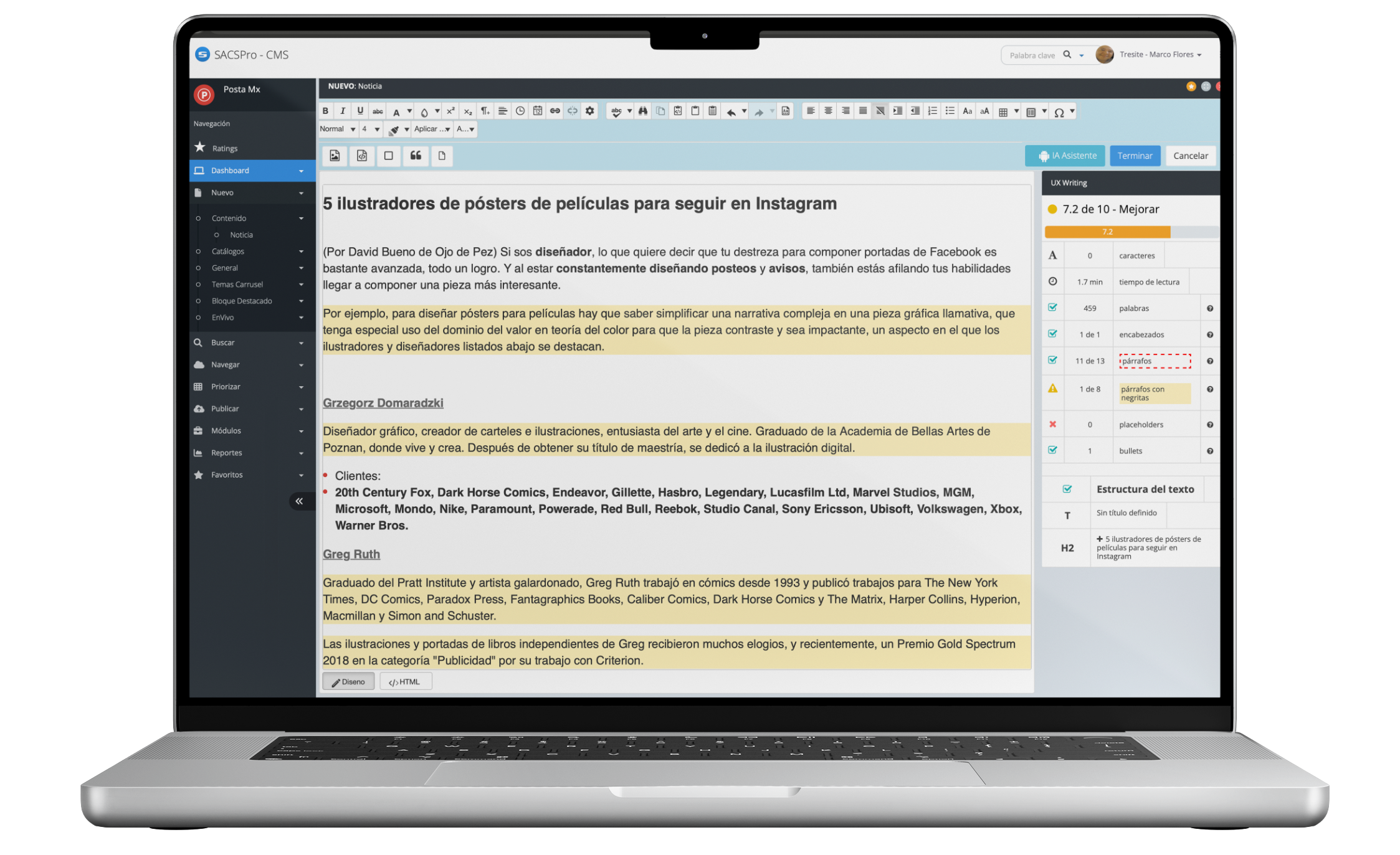
Before
- Visual clutter
- Complex interaction flows
- Low discoverability
- Inconsistent UI patterns
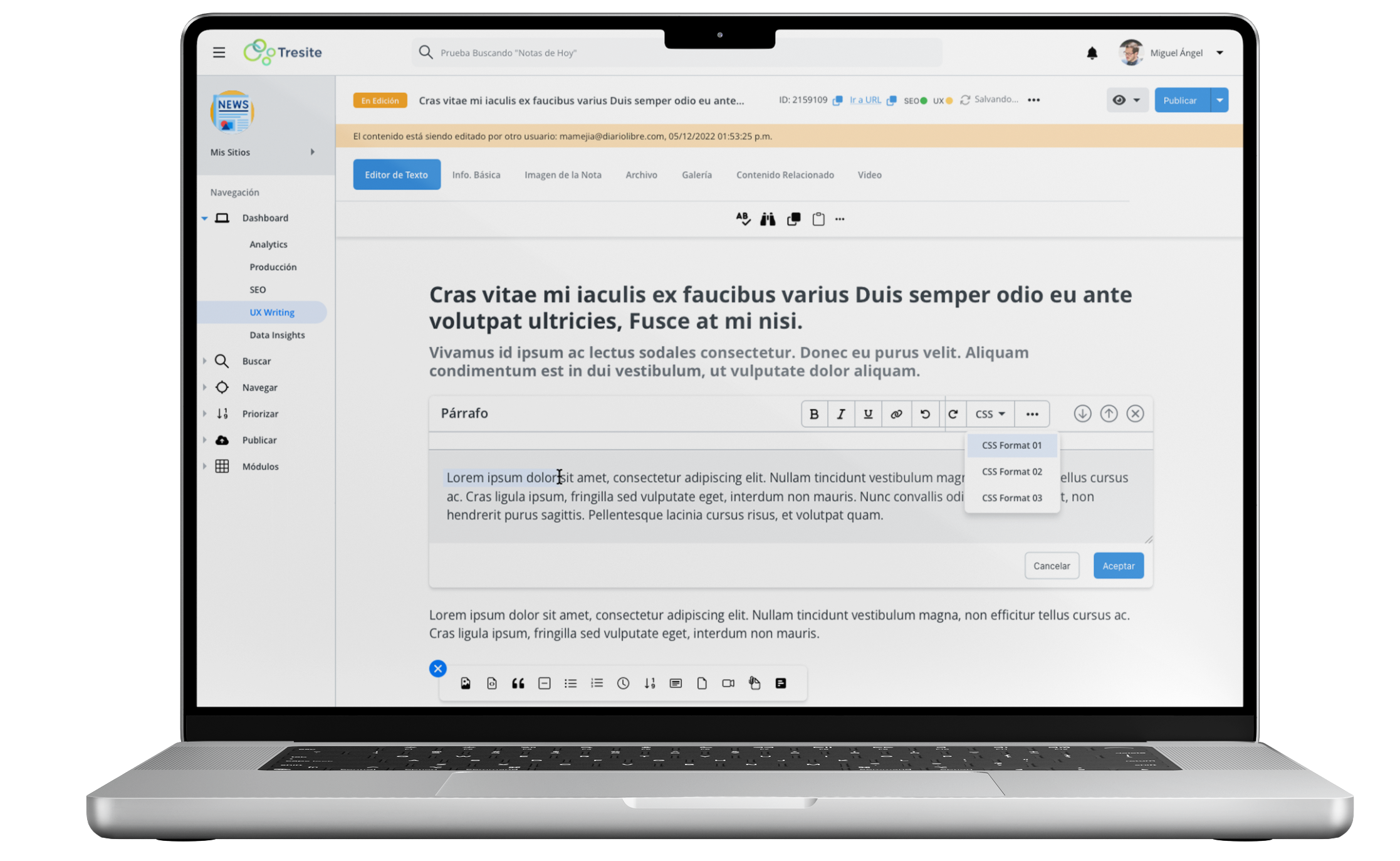
After
- Cleaner and scalable interface
- Simplified publishing workflows
- Improved navigation clarity
- Better visual hierarchy
- Increased usability and consistency
Outcome
The redesign was fully implemented across 8 core modules — Article Form, Content Editor, Image Gallery, Content Prioritization, AI Assistant, UX Writing, Dashboard, and Data Insights — serving approximately 468 active users across media outlets by 2024. Key editorial actions that previously required 4 clicks were reduced to 2, cutting friction in workflows editors repeat dozens of times per day. The back-end team noted that the simplified component system made the platform significantly easier to customize for different media clients — directly addressing one of the platform's core business needs as a multi-outlet CMS.
Takeaway
Designing for a multi-client editorial platform means every decision has to work at scale — not just for one newsroom, but for any newsroom that uses the system. The biggest lesson from SACS was that simplicity in a component system isn't just a UX win. It's a business win: a simpler interface means faster onboarding, easier customization, and lower support overhead for the product team. Cutting navigation from 4 steps to 2 sounds small. For an editor publishing 20 stories a day, it compounds into hours recovered every week.
Designing for news platforms requires balancing clarity, speed, and density.
This project focused on creating an editorial system that allows content to scale without sacrificing usability or trust.
SACS Pro, CMS
Designing a scalable CMS experience for faster editorial publishing workflows.
Focus: CMS / Editorial Platform / UX Strategy
Role: UX/UI Designer
Platform: Responsive Web Platform / Simplified Mobile Experience
Audience: Journalists, Editors, and Editorial Teams
Year: 2025
Team: Product Owner, Developers, Sole Designer
Design System: Adapted from Admin UI Color library
Primary Modules: Article Form, Content Editor, Image Gallery, Content Prioritization, AI Assistant, UX Writing, Dashboard, Data Insights
Research: I interviewed 5 editors to understand their pain points.
Testing: I ran moderated usability tests with 3 specific tasks.
Key finding: Publishing required 4 clicks — too slow for breaking news.Decision: Simplified to 2 clicks based on test results.
Context
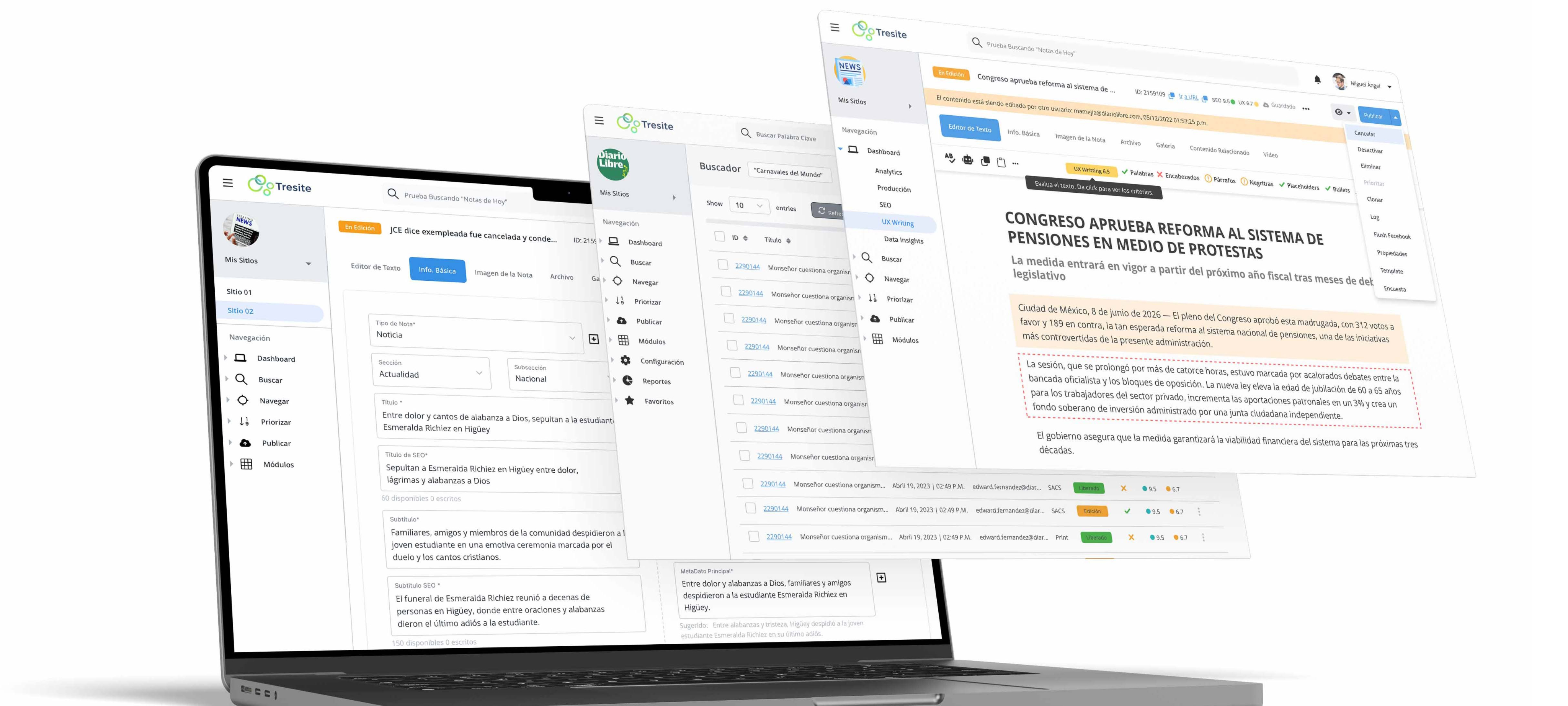
SACS is a modular CMS platform designed for editorial teams managing high-volume digital content. Used by media outlets and publishers across LATAM, the platform serves approximately 468 active users. As the sole designer on the project, I led the redesign of 8 core modules working within the Color Admin UI framework — adapting and extending the existing component library to meet editorial-specific needs without rebuilding the system from scratch. This constraint shaped every decision: the goal wasn't a blank-canvas redesign, but a smarter use of what already existed.
Problem
- No clear information hierarchy in editorial workflows.
- Many users relied on repetitive actions and inefficient navigation.
- The experience depended too heavily on outdated interaction patterns.
Constraints
- Editorial teams with varying technical experience.
- The platform was also highly customizable for different media clients, requiring flexible interface solutions.
- Legacy components and backend limitations.
Goals
- Create a more intuitive editorial workflow.
- Reduce cognitive overload and interface clutter.
- Improve content discoverability and task efficiency.
- Streamline publishing actions across modules.
- Establish scalable UI patterns for future growth.
- Improve usability across editorial roles.
Process
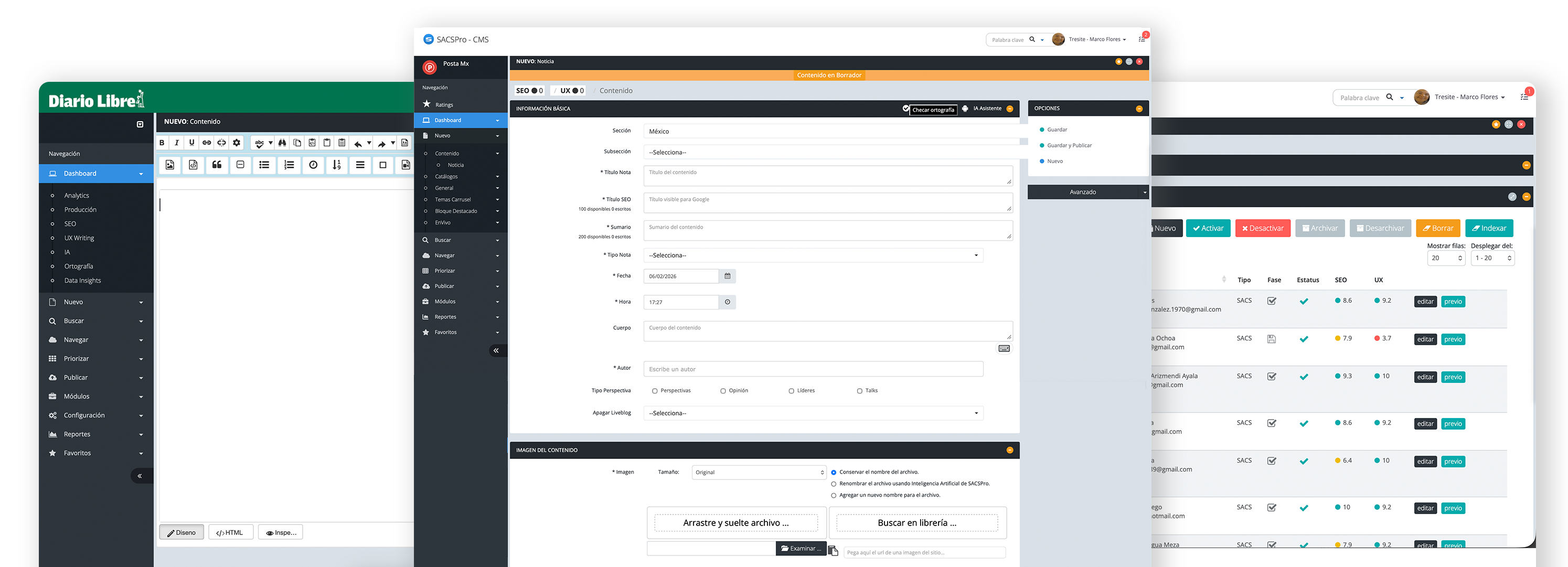
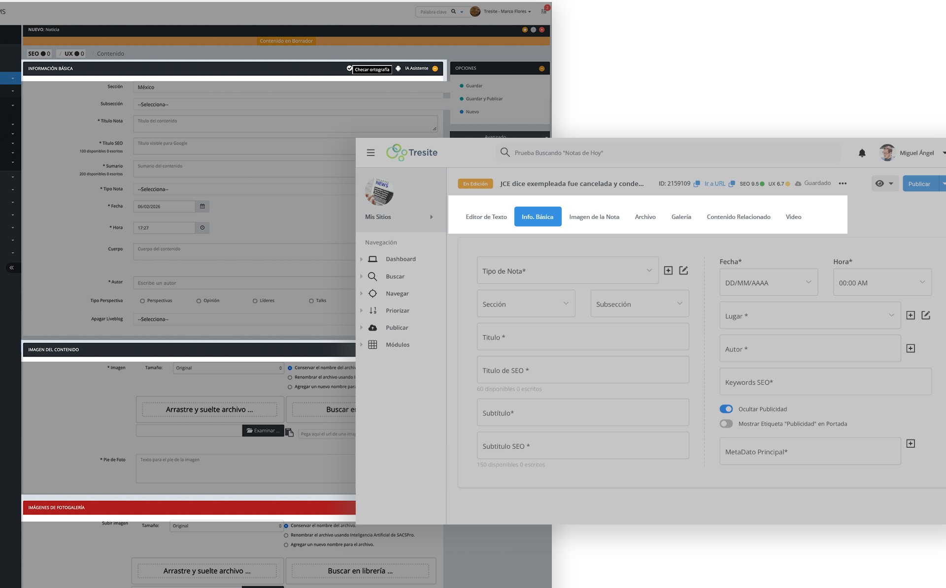
The redesign started from a core usability problem in the Article Form — the most-used module in the platform. Editors were working with a single, continuous scroll that mixed basic metadata, image upload, gallery management, and video in one unstructured page. Everything was visible at once, which meant nothing felt prioritized.
The solution was a tab-based architecture that restructured the workflow from one long sequential form into a focused, task-based system: Editor de Texto, Info. Básica, Imagen de la Nota, Archivo, Galería, Contenido Relacionado, and Video. Each tab shows only what's needed for that specific step — turning a 4-stage sequential process into 2 primary decision points per session, reducing cognitive load and making it harder to miss required fields.
This same logic — show only what's needed, when it's needed — became the design principle applied across all 8 modules. Every redesign decision traced back to the same question: what does this editor actually need to do right now, and what's getting in the way?
All modules were redesigned within the Color Admin UI framework, extending and adapting existing components rather than rebuilding from scratch — a constraint that required as much editorial judgment as visual design.t
Article Form: from a single scroll to a task-based tab architecture
Strategy
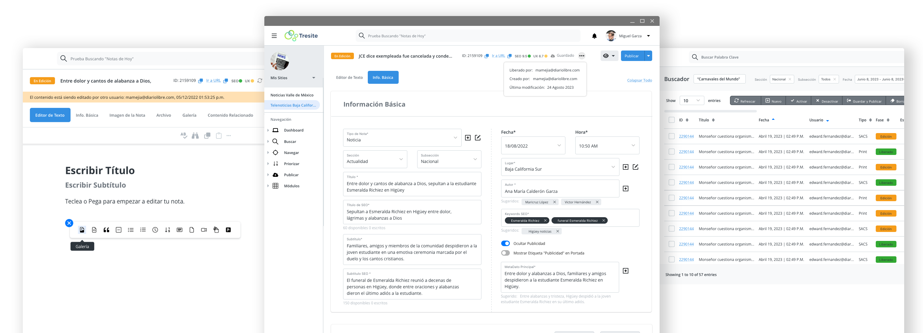
- Reorganized navigation around editorial priorities.
- Simplified publishing workflows across the project input form, content editor, and search experience.
- Introduced reusable interface patterns for consistency.
- Improved visual hierarchy using spacing, typography, and layout.
- Optimized content organization for faster scanning and task completion.
- Built scalable UI foundations using the Color Admin framework as a base system for consistency and faster implementation.
Before
- Visual clutter
- Complex interaction flows
- Low discoverability
- Inconsistent UI patterns
After
- Cleaner and scalable interface
- Simplified publishing workflows
- Improved navigation clarity
- Better visual hierarchy
- Increased usability and consistency
Outcome
The redesign was fully implemented across 8 core modules — Article Form, Content Editor, Image Gallery, Content Prioritization, AI Assistant, UX Writing, Dashboard, and Data Insights — serving approximately 468 active users across media outlets by 2024. Key editorial actions that previously required 4 clicks were reduced to 2, cutting friction in workflows editors repeat dozens of times per day. The back-end team noted that the simplified component system made the platform significantly easier to customize for different media clients — directly addressing one of the platform's core business needs as a multi-outlet CMS.
Takeaway
Designing for a multi-client editorial platform means every decision has to work at scale — not just for one newsroom, but for any newsroom that uses the system. The biggest lesson from SACS was that simplicity in a component system isn't just a UX win. It's a business win: a simpler interface means faster onboarding, easier customization, and lower support overhead for the product team. Cutting navigation from 4 steps to 2 sounds small. For an editor publishing 20 stories a day, it compounds into hours recovered every week.
Designing for news platforms requires balancing clarity, speed, and density.
This project focused on creating an editorial system that allows content to scale without sacrificing usability or trust.
SACS Pro, CMS
Designing Within Constraints for a Multi-Client CMS
Focus: CMS / Editorial Platform / UX Strategy
Role: UX/UI Designer
Platform: Responsive Web Platform / Simplified Mobile Experience
Audience: Journalists, Editors, and Editorial Teams
Year: 2025
Team: Product Owner, Developers, Sole Designer
Design System: Adapted from Admin UI Color library
Primary Modules: Article Form, Content Editor, Image Gallery, Content Prioritization, AI Assistant, UX Writing, Dashboard, Data Insights
Research: I interviewed 5 editors to understand their pain points.
Testing: I ran moderated usability tests with 3 specific tasks.
Key finding: Publishing required 4 clicks — too slow for breaking news.
Decision: Simplified to 2 clicks based on test results.
Context
SACS Pro is a modular CMS platform built by Tresite and sold to media outlets and publishers across LATAM, serving approximately 468 active users across multiple newsrooms. As the sole designer on the project, I led the redesign of 8 core modules working within the existing Color Admin UI framework — adapting and extending the component library to meet editorial-specific needs without rebuilding the system from scratch. This constraint shaped every decision: the goal wasn't a blank-canvas redesign, but a smarter use of what already existed.
Problem
- No clear information hierarchy in editorial workflows.
- Many users relied on repetitive actions and inefficient navigation.
- The experience depended too heavily on outdated interaction patterns.
Constraints
- Editorial teams with varying technical experience.
- The platform was also highly customizable for different media clients, requiring flexible interface solutions.
- Legacy components and backend limitations.
Goals
- Create a more intuitive editorial workflow.
- Reduce cognitive overload and interface clutter.
- Improve content discoverability and task efficiency.
- Streamline publishing actions across modules.
- Establish scalable UI patterns for future growth.
- Improve usability across editorial roles.
Process
The redesign started from a core usability problem in the Article Form — the most-used module in the platform. Editors were working with a single, continuous scroll that mixed basic metadata, image upload, gallery management, and video in one unstructured page. Everything was visible at once, which meant nothing felt prioritized.
The solution was a tab-based architecture that restructured the workflow from one long sequential form into a focused, task-based system: Editor de Texto, Info. Básica, Imagen de la Nota, Archivo, Galería, Contenido Relacionado, and Video. Each tab shows only what's needed for that specific step — turning a 4-stage sequential process into 2 primary decision points per session, reducing cognitive load and making it harder to miss required fields.
This same logic — show only what's needed, when it's needed — became the design principle applied across all 8 modules. Every redesign decision traced back to the same question: what does this editor actually need to do right now, and what's getting in the way?
All modules were redesigned within the Color Admin UI framework, extending and adapting existing components rather than rebuilding from scratch — a constraint that required as much editorial judgment as visual design.t
Article Form: from a single scroll to a task-based tab architecture
Strategy
- Reorganized navigation around editorial priorities.
- Simplified publishing workflows across the project input form, content editor, and search experience.
- Introduced reusable interface patterns for consistency.
- Improved visual hierarchy using spacing, typography, and layout.
- Optimized content organization for faster scanning and task completion.
- Built scalable UI foundations using the Color Admin framework as a base system for consistency and faster implementation.
Before
- Visual clutter
- Complex interaction flows
- Low discoverability
- Inconsistent UI patterns
After
- Cleaner and scalable interface
- Simplified publishing workflows
- Improved navigation clarity
- Better visual hierarchy
- Increased usability and consistency
Outcome
The redesign was fully implemented across 8 core modules — Article Form, Content Editor, Image Gallery, Content Prioritization, AI Assistant, UX Writing, Dashboard, and Data Insights — serving approximately 468 active users across media outlets by 2024. The Article Form's shift from a single continuous scroll to a task-based structure removed friction from a workflow editors repeat dozens of times per day. Tresite's back-end team noted that the simplified component system made the platform significantly easier to customize for different media clients — directly addressing one of the platform's core business needs as a multi-outlet CMS.
Takeaway
Designing for a multi-client editorial platform means every decision has to work at scale — not just for one newsroom, but for any newsroom that uses the system. The biggest lesson from SACS was that simplicity in a component system isn't just a UX win. It's a business win: a simpler interface means faster onboarding, easier customization, and lower support overhead for the product team. Cutting navigation from 4 steps to 2 sounds small. For an editor publishing 20 stories a day, it compounds into hours recovered every week.
Designing for news platforms requires balancing clarity, speed, and density.
This project focused on creating an editorial system that allows content to scale without sacrificing usability or trust.