El Mañana de Reynosa
Full redesign of a regional news platform serving 80,000+ monthly readers
Focus: Editorial hierarchy • Modular Systems • Advertising-aware UX
Role: Lead UX/UI & Editorial Designer
Platform: Responsive Web
Audience: Mature audience, loyal readers
Year: 2025
Context
El Mañana de Reynosa is the leading regional newspaper in northeastern Mexico, with over 80,000 monthly unique users. When I joined the project, the site had solid content and a navigation structure that worked — but a visual presentation that no longer reflected the editorial authority of the publication or met current standards for readability and information hierarchy on screen.
Problem
El Mañana de Reynosa is the leading regional newspaper in northeastern Mexico, with over 80,000 monthly users. The publication has editorial authority built over decades — but its digital presence didn't reflect that weight.
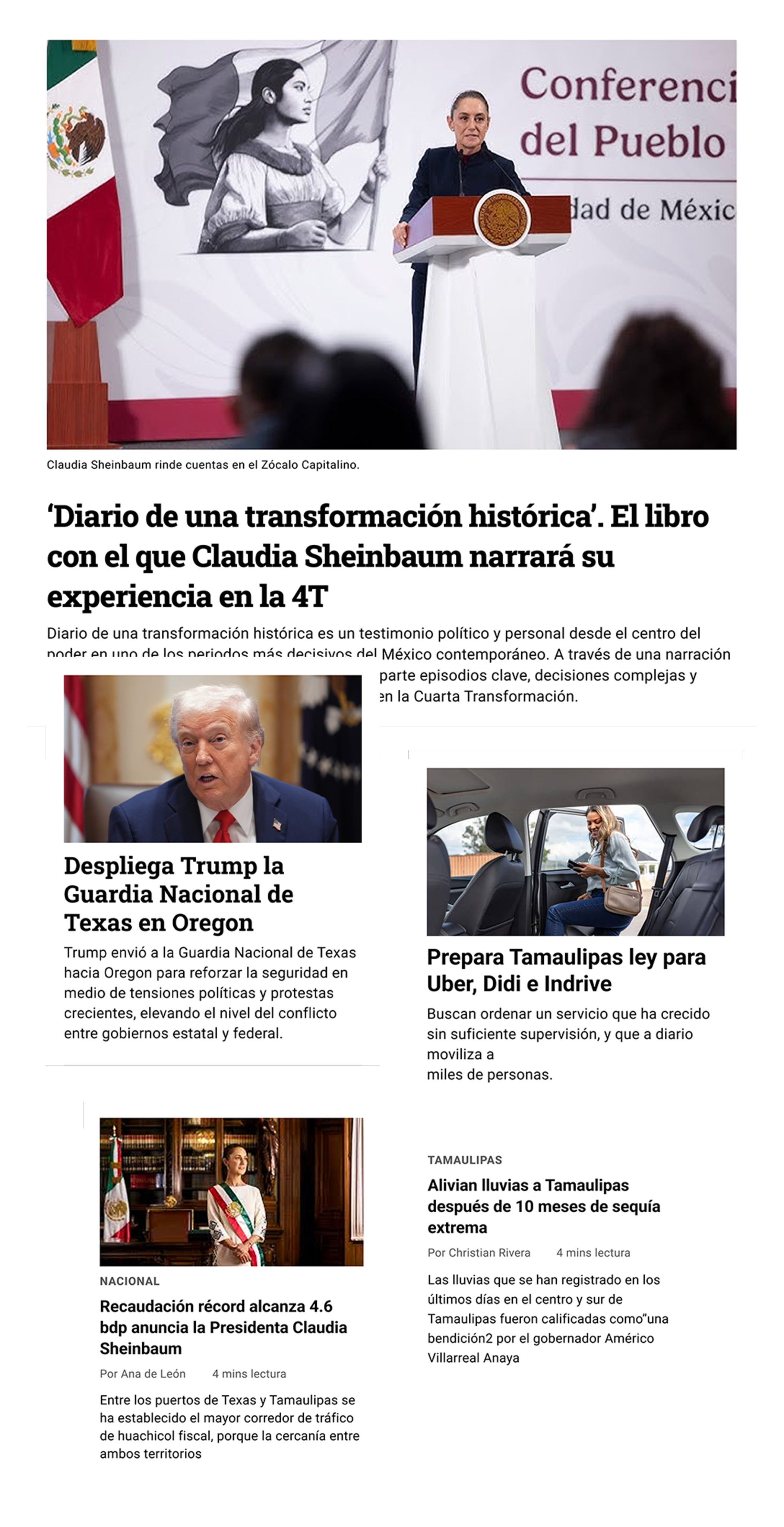
The existing site felt visually dated compared to other regional news platforms. Typography and color choices undermined the publication's credibility rather than reinforcing it. Content was compressed with no visual breathing room, making it difficult for readers to scan, prioritize, or orient themselves within the homepage.
The navigation structure worked. The problem was purely
visual: the design wasn't communicating the authority the editorial content deserved.
Note: The redesign has been approved by the client and is currently in the implementation phase. The original site remains live at elmanana.com.
Constraints
- High-frequency content updates
- Multiple editorial priorities
- Existing advertising requirements
- Audience accustomed to dense information layouts
Goals
- Improve editorial hierarchy and readability
- Enable faster content scanning for repeat visitors
- Create a modular, scalable homepage system
- Integrate advertising without disrupting the reading experience
- Align the platform with modern digital news standards
Strategy
- Established a dominant lead story at the top to anchor each visit with a clear editorial priority
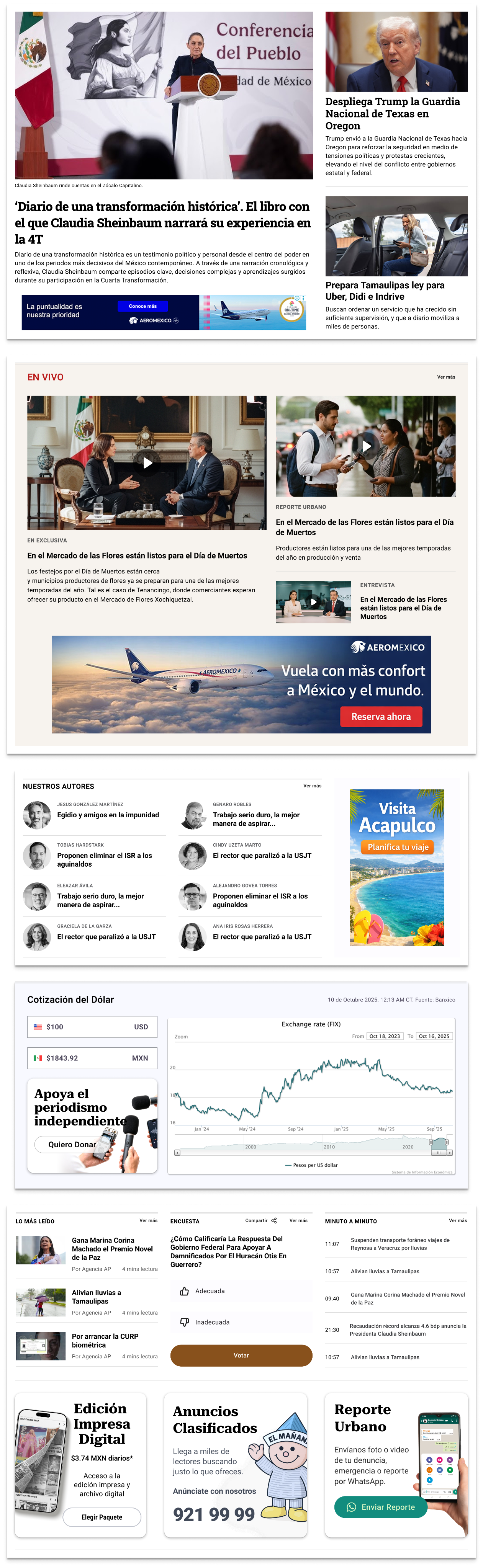
- Created named, visually separated sections (Nuestros Autores, Lo Más Leído, En Vivo) so readers can orient themselves immediately
- Contained advertising in dedicated blocks, visually distinct from editorial content
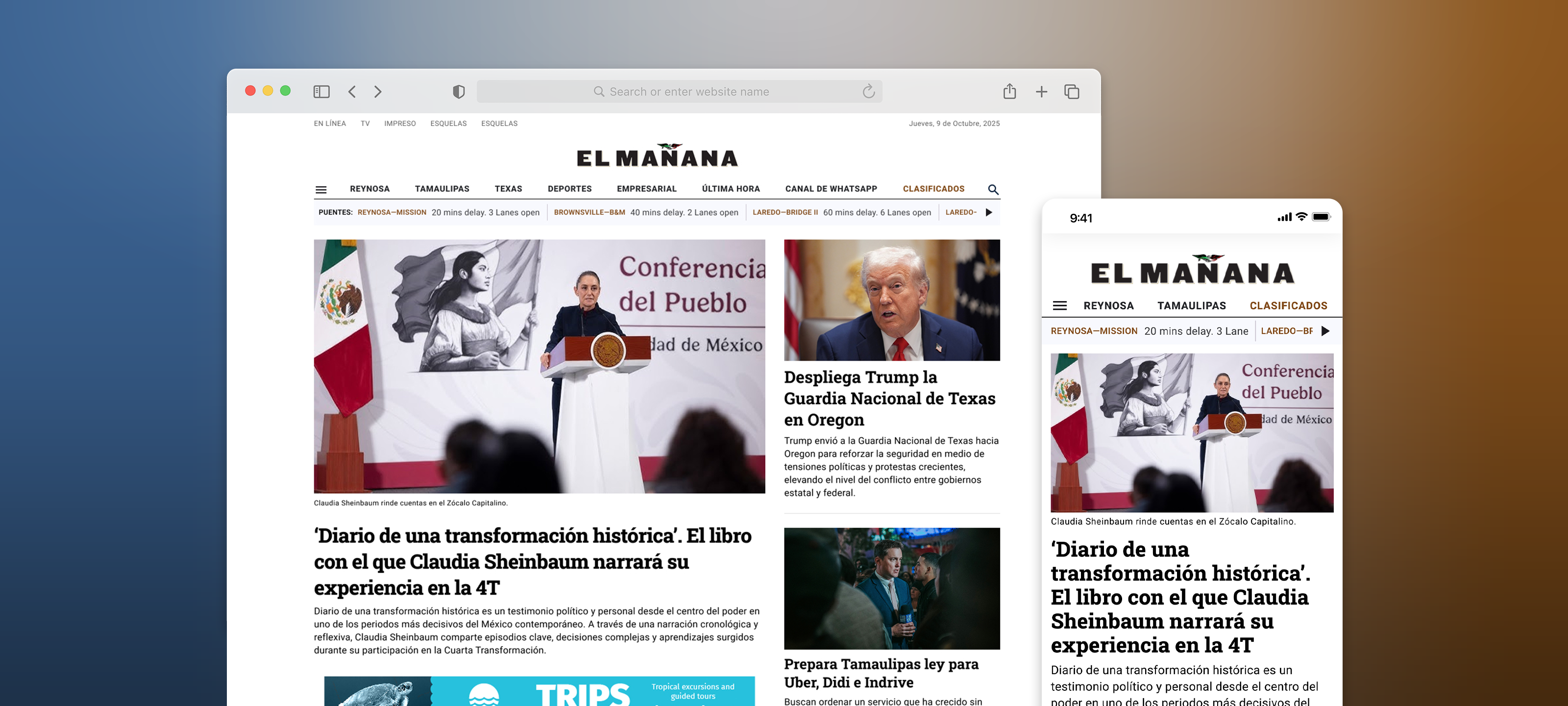
- Rebuilt the header to restore institutional weight and navigational clarity
- Applied a typographic scale that differentiates primary, secondary, and supporting content
Process
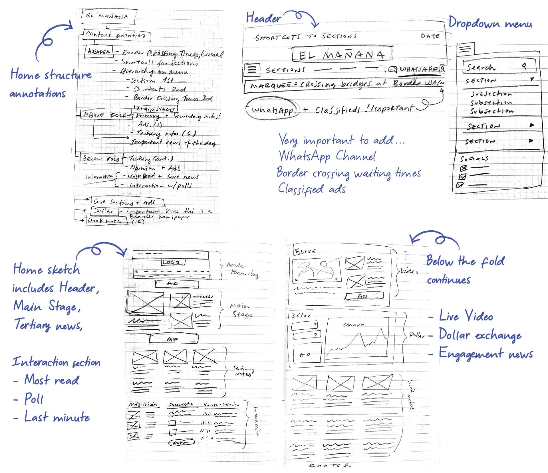
The redesign started from editorial logic, not visual preferences. Drawing on experience designing newspaper homepages since 2005, I mapped content priorities before touching layout: what does a returning reader need to find in the first scroll? What's breaking, what's evergreen, what's institutional?
An initial structure was defined independently, then refined through direct sessions with the publication's owner — adjusting section order and content emphasis based on his knowledge of the audience.
Initial structure mapped from editorial priorities before touching layout:
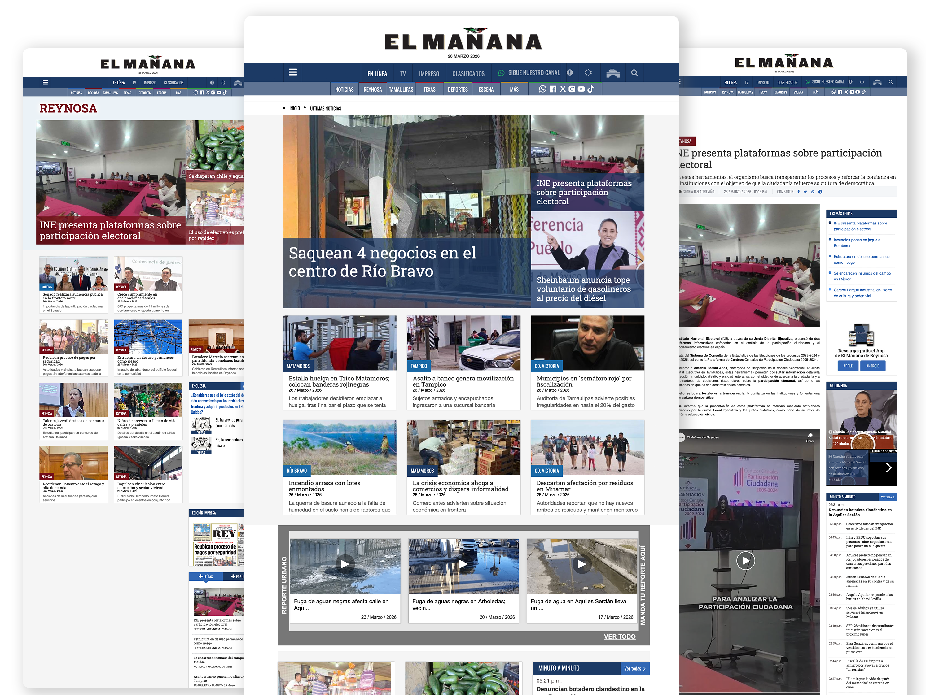
Before
- Visual overload
- Competing headlines
- Weak hierarchy
- Low scan efficiency

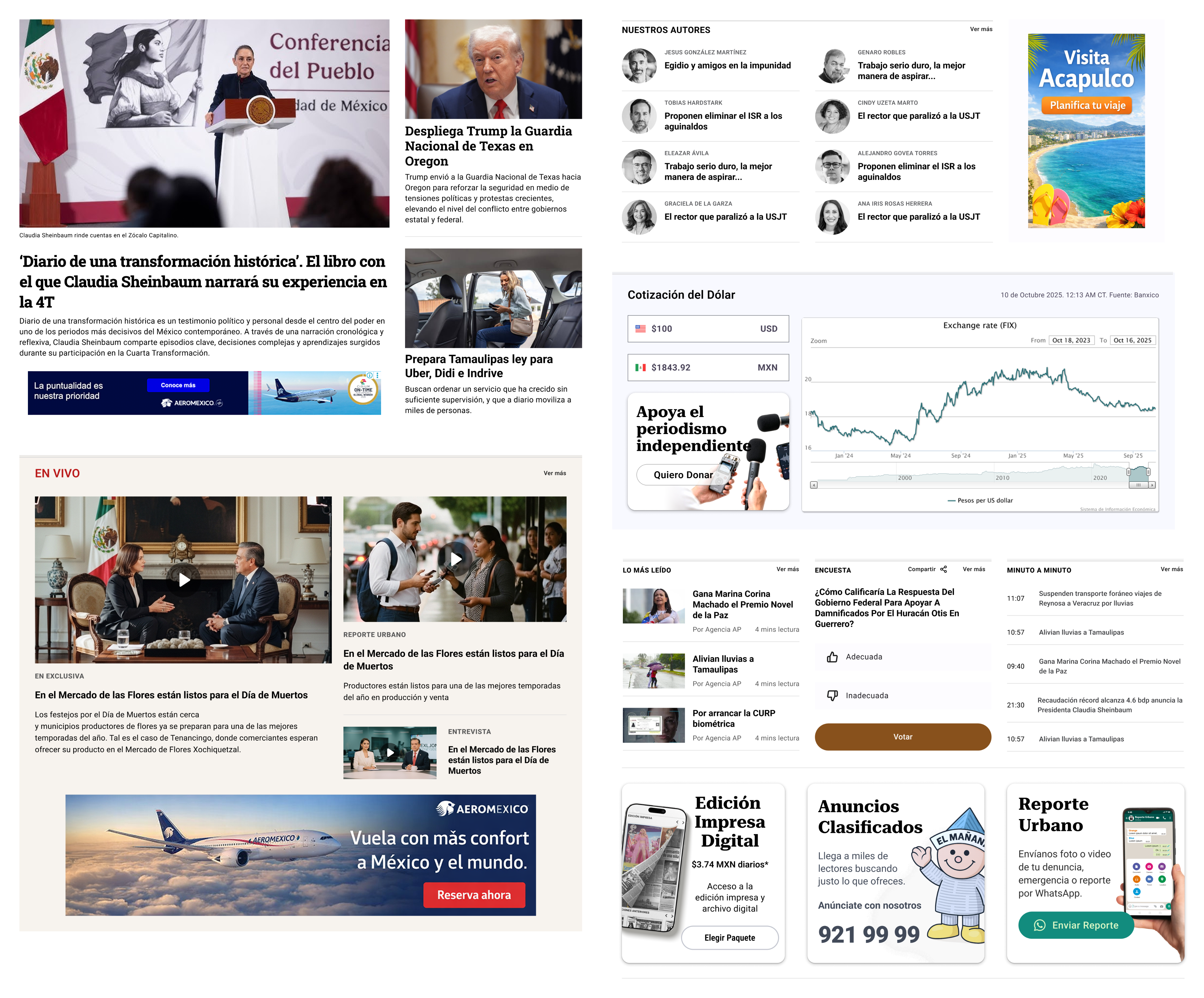
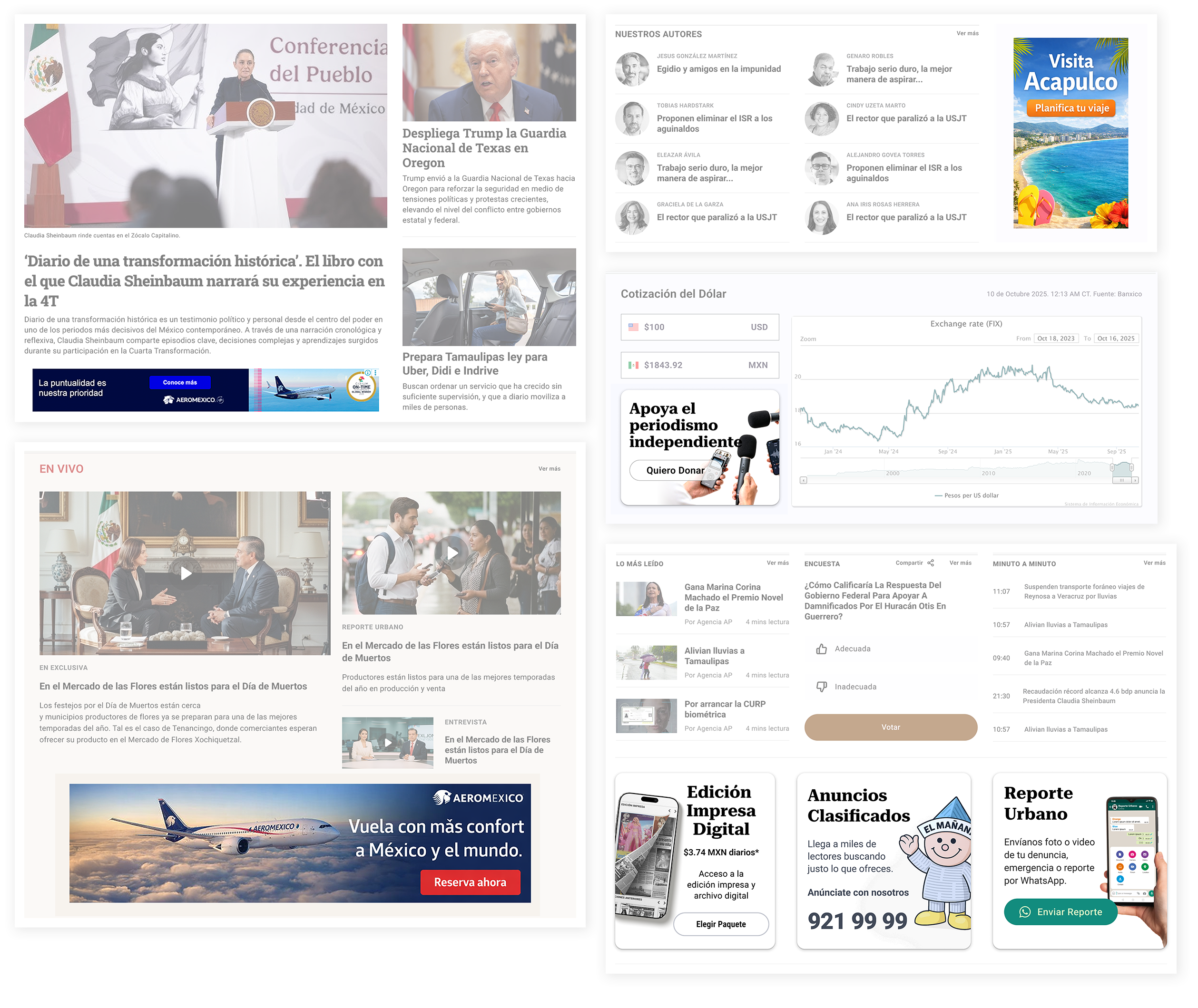
After
- Clear content structure
- Faster visual scanning
- Stronger editorial identity
- Improved trust and readability
Hierarchy
Improved typographic scale and spacing to clearly differentiate primary, secondary, and supporting content.
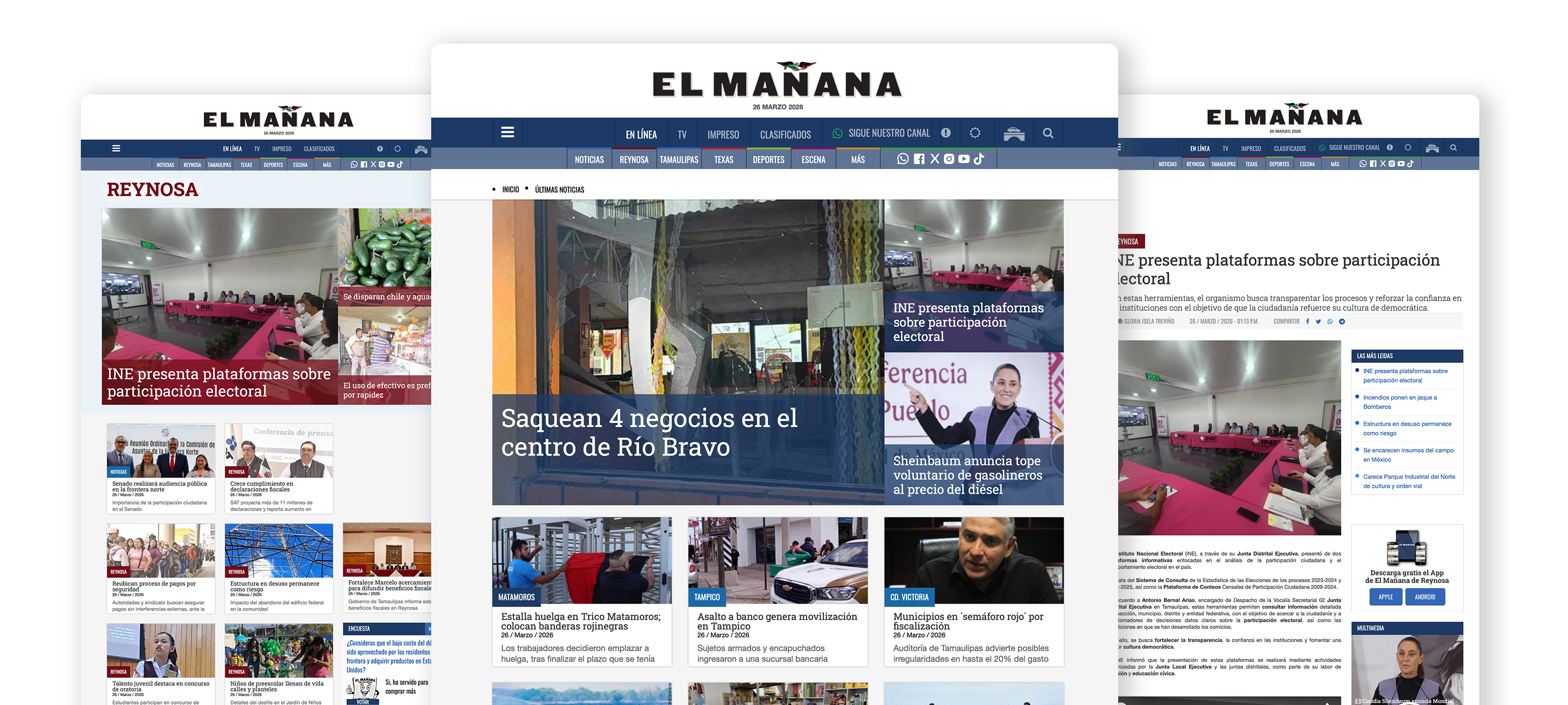
Section Organization
Distinct editorial sections with consistent structure to help users orient themselves quickly.
Advertising Integration
Ads are visually separated while remaining aligned with the overall grid and rhythm of the page.
Outcome
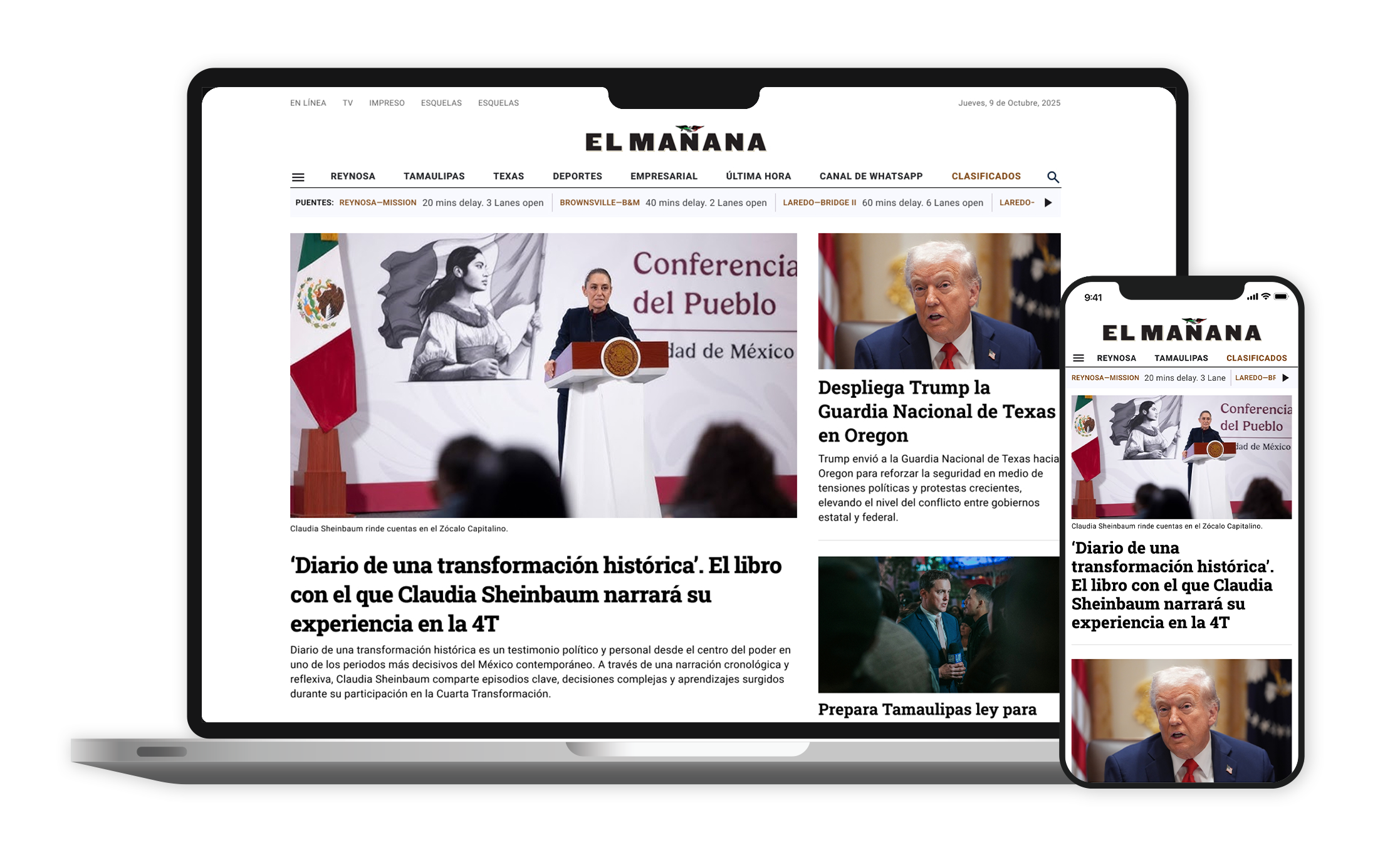
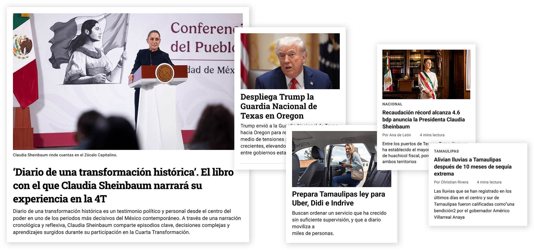
The redesign covered 20 distinct templates across web and mobile — homepage, section pages, article layouts, opinion, obituaries, membership, classified ads, and more — delivering a complete design system rather than a single-page refresh.
The client approved the work describing the result as "more modern but traditional, clean, serious, and credible" — a balance that reflects the core tension of the project: retaining trust with an older, loyal readership while building visual credibility with younger audiences accustomed to publications like The New York Times, El País, and The Washington Post.
The complete Figma handoff package is currently in the development implementation phase.
Takeaway
Designing for news is a discipline, not a style choice.
Twenty years of editorial experience meant I could make structural decisions quickly and with confidence — and defend them when challenged. The best outcome wasn't just a cleaner homepage. It was a client who finally felt his newspaper looked like it belonged alongside the nationals.
El Mañana de Reynosa
Full redesign of a regional news platform serving 80,000+ monthly readers
Focus: Editorial hierarchy • Modular Systems • Advertising-aware UX
Role: Lead UX/UI & Editorial Designer
Platform: Responsive Web
Audience: Mature audience, loyal readers
Year: 2025
Context
El Mañana de Reynosa is the leading regional newspaper in northeastern Mexico, with over 80,000 monthly unique users. When I joined the project, the site had solid content and a navigation structure that worked — but a visual presentation that no longer reflected the editorial authority of the publication or met current standards for readability and information hierarchy on screen.
Problem
El Mañana de Reynosa is the leading regional newspaper in northeastern Mexico, with over 80,000 monthly users. The publication has editorial authority built over decades — but its digital presence didn't reflect that weight.
The existing site felt visually dated compared to other regional news platforms. Typography and color choices undermined the publication's credibility rather than reinforcing it. Content was compressed with no visual breathing room, making it difficult for readers to scan, prioritize, or orient themselves within the homepage.
The navigation structure worked. The problem was purely
visual: the design wasn't communicating the authority the editorial content deserved.
Note: The redesign has been approved by the client and is currently in the implementation phase. The original site remains live at elmanana.com.
Constraints
- High-frequency content updates
- Multiple editorial priorities
- Existing advertising requirements
- Audience accustomed to dense information layouts
Goals
- Improve editorial hierarchy and readability
- Enable faster content scanning for repeat visitors
- Create a modular, scalable homepage system
- Integrate advertising without disrupting the reading experience
- Align the platform with modern digital news standards
Strategy
- Established a dominant lead story at the top to anchor each visit with a clear editorial priority
- Created named, visually separated sections (Nuestros Autores, Lo Más Leído, En Vivo) so readers can orient themselves immediately
- Contained advertising in dedicated blocks, visually distinct from editorial content
- Rebuilt the header to restore institutional weight and navigational clarity
- Applied a typographic scale that differentiates primary, secondary, and supporting content
Process
The redesign started from editorial logic, not visual preferences. Drawing on experience designing newspaper homepages since 2005, I mapped content priorities before touching layout: what does a returning reader need to find in the first scroll? What's breaking, what's evergreen, what's institutional?
An initial structure was defined independently, then refined through direct sessions with the publication's owner — adjusting section order and content emphasis based on his knowledge of the audience.
Initial structure mapped from editorial priorities before touching layout:
Before
- Visual overload
- Competing headlines
- Weak hierarchy
- Low scan efficiency
After
- Clear content structure
- Faster visual scanning
- Stronger editorial identity
- Improved trust and readability
Hierarchy
Improved typographic scale and spacing to clearly differentiate primary, secondary, and supporting content.
Section Organization
Distinct editorial sections with consistent structure to help users orient themselves quickly.
Advertising Integration
Ads are visually separated while remaining aligned with the overall grid and rhythm of the page.
Outcome
The redesign covered 20 distinct templates across web and mobile — homepage, section pages, article layouts, opinion, obituaries, membership, classified ads, and more — delivering a complete design system rather than a single-page refresh.
The client approved the work describing the result as "more modern but traditional, clean, serious, and credible" — a balance that reflects the core tension of the project: retaining trust with an older, loyal readership while building visual credibility with younger audiences accustomed to publications like The New York Times, El País, and The Washington Post.
The complete Figma handoff package is currently in the development implementation phase.
Takeaway
Designing for news is a discipline, not a style choice.
Twenty years of editorial experience meant I could make structural decisions quickly and with confidence — and defend them when challenged. The best outcome wasn't just a cleaner homepage. It was a client who finally felt his newspaper looked like it belonged alongside the nationals.
El Mañana de Reynosa
Full redesign of a regional news platform serving 80,000+ monthly readers
Focus: Editorial hierarchy • Modular Systems • Advertising-aware UX
Role: Lead UX/UI & Editorial Designer
Platform: Responsive Web
Audience: Mature audience, loyal readers
Year: 2025
Context
El Mañana de Reynosa is the leading regional newspaper in northeastern Mexico, with over 80,000 monthly unique users. When I joined the project, the site had solid content and a navigation structure that worked — but a visual presentation that no longer reflected the editorial authority of the publication or met current standards for readability and information hierarchy on screen.
Problem
El Mañana de Reynosa is the leading regional newspaper in northeastern Mexico, with over 80,000 monthly users. The publication has editorial authority built over decades — but its digital presence didn't reflect that weight.
The existing site felt visually dated compared to other regional news platforms. Typography and color choices undermined the publication's credibility rather than reinforcing it. Content was compressed with no visual breathing room, making it difficult for readers to scan, prioritize, or orient themselves within the homepage.
The navigation structure worked. The problem was purely visual: the design wasn't communicating the authority the editorial content deserved.
Note: The redesign has been approved by the client and is currently in the implementation phase. The original site remains live at elmanana.com.
Constraints
- High-frequency content updates
- Multiple editorial priorities
- Existing advertising requirements
- Audience accustomed to dense information layouts
Goals
- Improve editorial hierarchy and readability
- Enable faster content scanning for repeat visitors
- Create a modular, scalable homepage system
- Integrate advertising without disrupting the reading experience
- Align the platform with modern digital news standards
Strategy
- Established a dominant lead story at the top to anchor each visit with a clear editorial priority
- Created named, visually separated sections (Nuestros Autores, Lo Más Leído, En Vivo) so readers can orient themselves immediately
- Contained advertising in dedicated blocks, visually distinct from editorial content
- Rebuilt the header to restore institutional weight and navigational clarity
- Applied a typographic scale that differentiates primary, secondary, and supporting content
Process
The redesign started from editorial logic, not visual preferences. Drawing on experience designing newspaper websites since 2005, I mapped content priorities before touching layout: what does a returning reader need to find in the first scroll? What's breaking, what's evergreen, what's institutional? I defined an initial structure independently, then refined it through direct sessions with the publication's owner — adjusting section order and content emphasis based on his knowledge of the audience. Only after that editorial foundation was set did the visual system follow: grid, typographic scale, color discipline, and a reusable component set delivered as a complete Figma handoff for the development team.
Initial structure mapped from editorial priorities before touching layout:
Before
- Visual overload
- Competing headlines
- Weak hierarchy
- Low scan efficiency
After
- Clear content structure
- Faster visual scanning
- Stronger editorial identity
- Improved trust and readability
Hierarchy
Improved typographic scale and spacing to clearly differentiate primary, secondary, and supporting content.
Section Organization
Distinct editorial sections with consistent structure to help users orient themselves quickly.
Advertising Integration
Ads are visually separated while remaining aligned with the overall grid and rhythm of the page.
Outcome
The redesign covered 20 distinct templates across web and mobile — homepage, section pages, article layouts, opinion, obituaries, membership, classified ads, and more — delivering a complete design system rather than a single-page refresh.
The client approved the work describing the result as "more modern but traditional, clean, serious, and credible" — a balance that reflects the core tension of the project: retaining trust with an older, loyal readership while building visual credibility with younger audiences accustomed to publications like The New York Times, El País, and The Washington Post.
The complete Figma handoff package is currently in the development implementation phase.
Takeaway
Designing for news is a discipline, not a style choice.
Twenty years of editorial experience meant I could make structural decisions quickly and with confidence — and defend them when challenged. The best outcome wasn't just a cleaner homepage. It was a client who finally felt his newspaper looked like it belonged alongside the nationals.