Legacy project
Banorte Mobile Banking
First mobile banking UX solution in Mexico
Award: Best Mobile Solution — AMIPCI E-Commerce LATAM Award 2010
Role: UX/UI Designer
Platform: Mobile Web (iPhone, BlackBerry), Tablet (iPad), ATM Network
Audience: Banorte retail banking customers, Mexico
Year: 2005–2010
Context
v
Problem
Customers had no way to check balances or move money outside of a branch visit. Banking on the go meant adapting dense financial information — balances, alerts, transfers, bill payments — into something legible on a 3-inch screen, years before responsive design existed as a discipline. On top of that, every device behaved differently: an iPhone Safari page didn't render anything like a BlackBerry browser, and neither had any existing pattern to follow.
Constraints
- No native apps — everything had to run inside mobile browsers circa 2008–2010, each with different rendering quirks
- Strict banking security and compliance requirements for every transaction screen
- A bilingual requirement (Spanish / English) across the entire ATM network
- No existing mobile banking pattern in the Mexican market to benchmark against
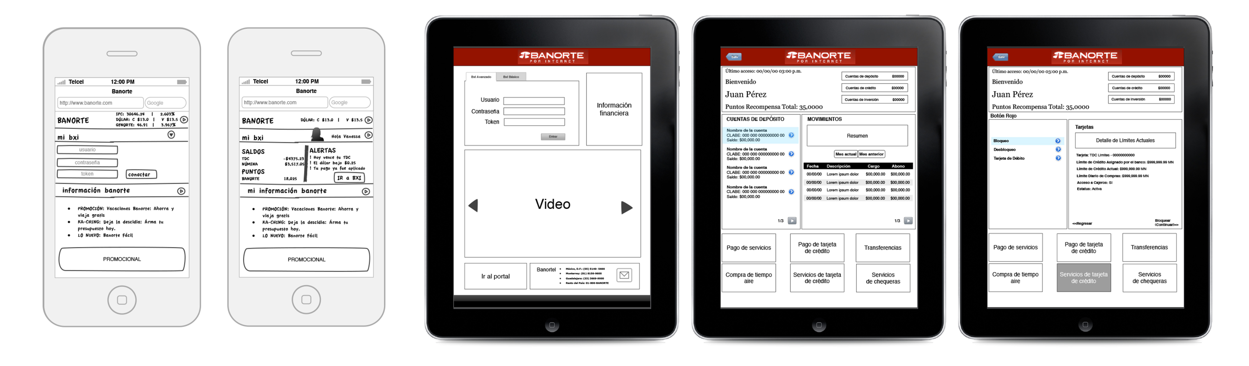
Early low-fidelity wireframes mapping the mobile login flow and at-a-glance account dashboard
Goals
- Give customers a fast, secure way to check balances and act on alerts from any device
- Establish one visual language that felt unmistakably Banorte, whether on desktop, mobile, or an ATM screen
- Prioritize the handful of actions customers reach for most — balance, alerts, transfers — above everything else
Process
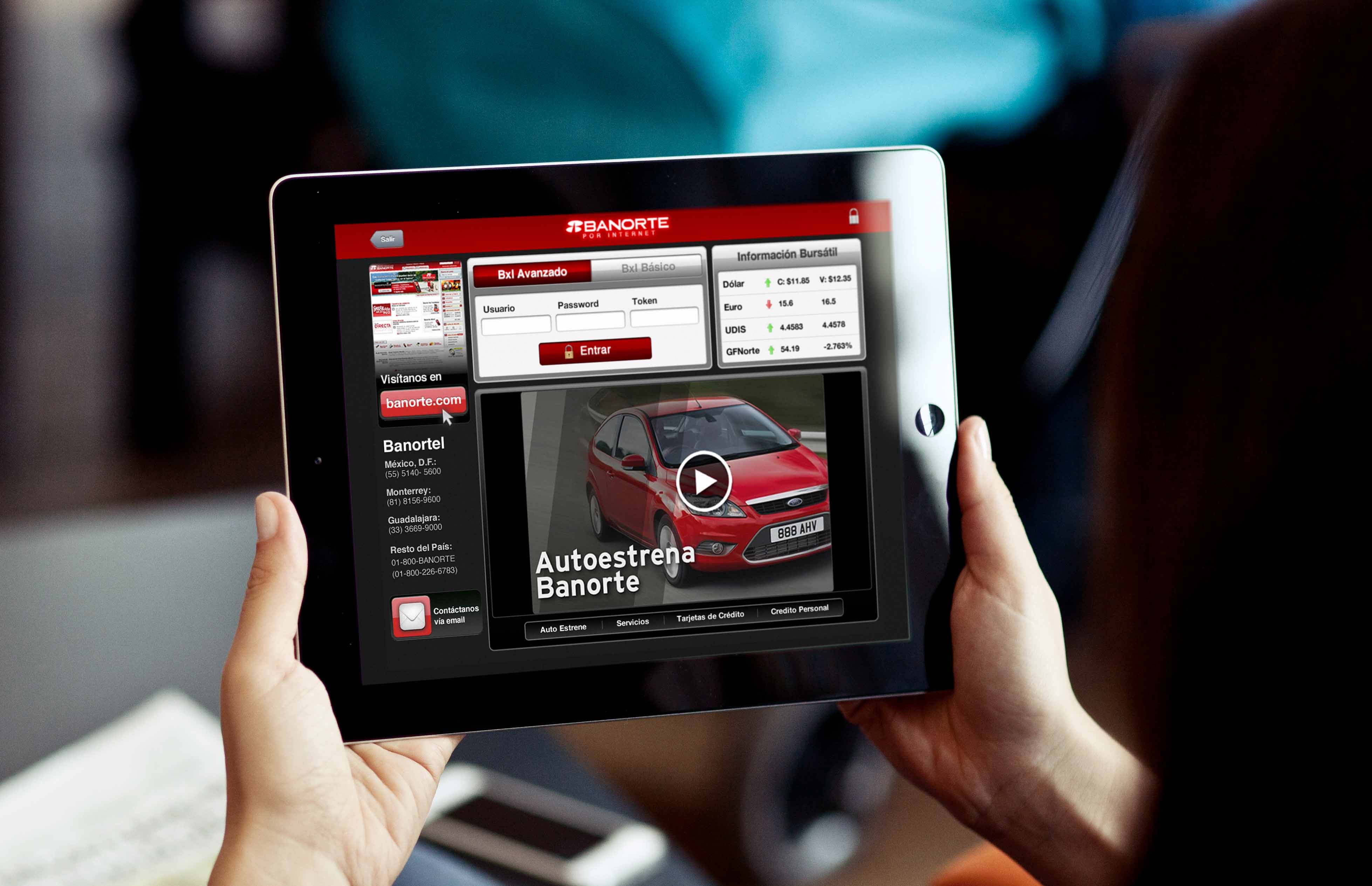
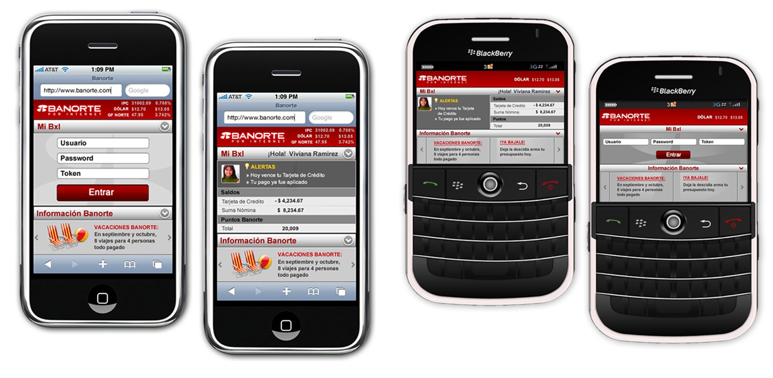
The work started on paper: rough wireframes for the mobile login and home screen, testing how much information could realistically live above the fold on a feature phone. From there, I moved into high-fidelity comps for each real device in market — iPhone, BlackBerry, and iPad — checking that the hierarchy of balances, alerts, and quick actions held up across very different screen sizes and input methods.
"From wireframe to device"
- Account balances and alerts surfaced immediately on login
- Identical information architecture adapted to touchscreen (iPhone) and trackball (BlackBerry) navigation
- Personalized greeting and contextual alerts to build trust at a glance
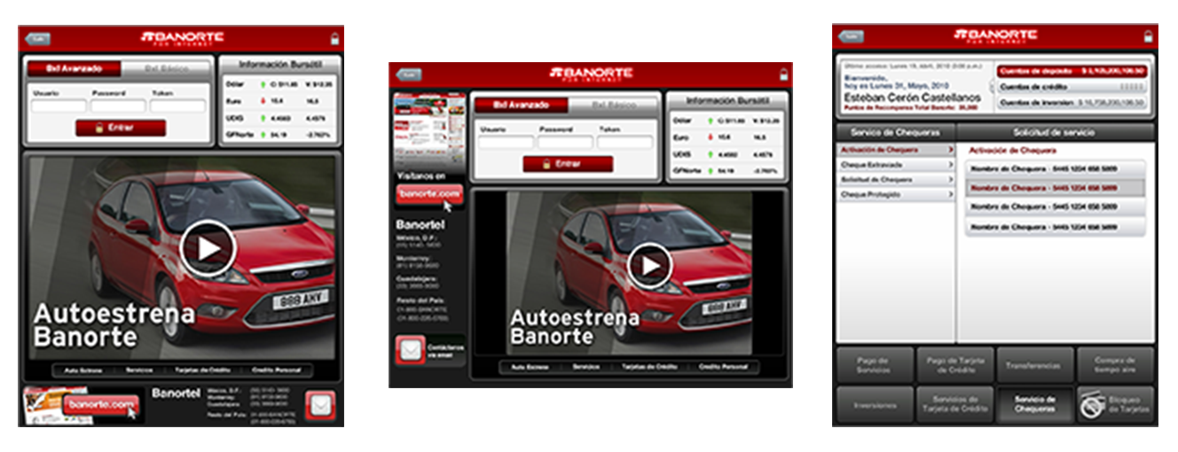
The same banking services restructured for the tablet — service requests, card activation, and chequebook management
Strategy
Rather than designing each platform in isolation, I built one underlying system — consistent typography, color, and component logic — and let each device's constraints shape its own layout. The result reads as one bank everywhere, even though no two screens are pixel-identical:
- A single hierarchy of information (balances → alerts → quick actions → promotions) repeated across every touchpoint
- Banorte's red and the security iconography customers already trusted, carried consistently from app to ATM
- Bilingual ATM screens designed so English and Spanish never competed for attention on the same line
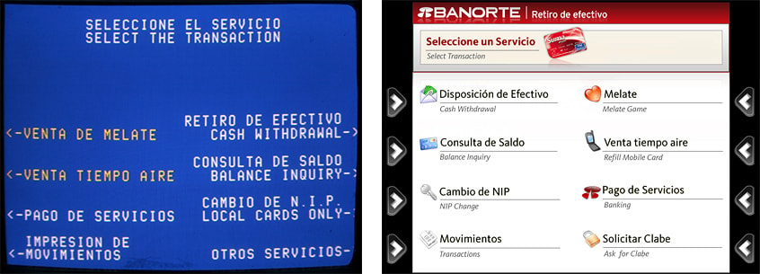
Redesigned ATM menu — eight core services surfaced clearly, in both Spanish and English
Every ATM session opens with a clear, bilingual security reminder before any transaction begins — a small UX decision that reinforced Banorte's trust positioning at the exact moment customers felt most exposed.
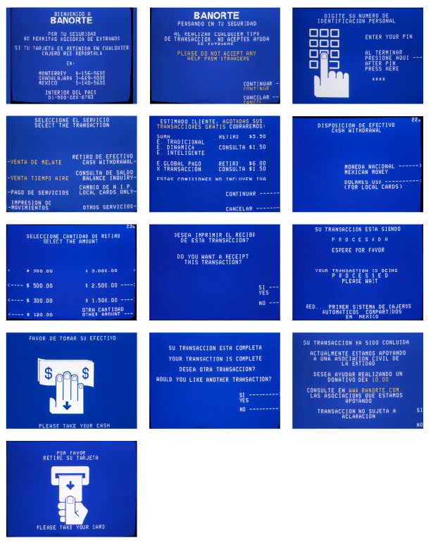
The complete withdrawal flow — PIN entry, service selection, amount, and confirmation — streamlined into as few steps as possible
Outcome
The project shipped as the first mobile banking solution in Mexico, reaching customers across iPhone, BlackBerry, and tablet years before responsive design was standard practice. It went on to win Best Mobile Solution in the Innovation Category at the AMIPCI E-Commerce LATAM Awards in 2010, recognized as a first for mobile banking UX in the Mexican market.
Takeaway
This project taught me to design systems, not screens. With no native apps, no design patterns to borrow, and three radically different devices to support, the only way to keep the experience coherent was to anchor everything in one shared hierarchy of information and let each platform express it on its own terms. It's a way of thinking I still bring to every multi-platform product today — long before "responsive" or "omnichannel" became the words for it.